The use of dyes to give colour to products is a common and obvious practice in industry. The colour palette is used by almost every manufacturing industry. The use of colours is intended to identify the product with the brand, increase product attractiveness, and evoke emotions or desirable customer behaviour.

Knowing the importance of colours in the lives of consumers and producers, we have prepared a large amount of information on this topic.
Light as a source of colour
When talking about colours, it is impossible not to mention light. It is one of the most important issues, and knowledge in this field will help you understand the mechanism of colour creation, and find the answer to the question of how we come to see things. So let us start from the very beginning.
The nature of light has been mysterious and difficult to understand for many years. Today, we know that light behaves both as a wave and as a stream of particles. This phenomenon is called a wave-particle duality.

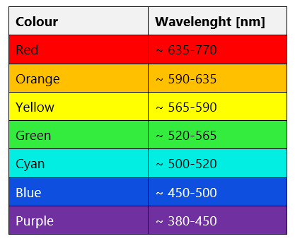
Electromagnetic waves with a length of 380-780 nanometres are called visible light. White light is produced by mixing seven simple single colours called the basic colours. After decomposing, they can be observed in the form of the commonly known seven colours of the rainbow. This phenomenon appears in the sky on sunny days when it rains. Falling drops of water act as a prism and split white light into its components, i.e. colours. Each of the seven colours corresponds to a specific wavelength range. Electromagnetic wave with the longest wavelength (635-770 nm) is red, while the shortest one (380-450 nm) is responsible for seeing purple.
The basic colours that we see are shown below. If the wave is of intermediate length from two adjacent ranges, then transitional colours are created.
Why do we see colours?
Now that we know that certain electromagnetic wavelengths have a defined colour, let us consider why we see colourful objects.
Colour vision results directly from the sensitivity of the respective receptors in the eye to the light wavelength. We can see the colours of different objects (e.g. crayons or flowers) because they reflect and absorb the rays of light that fall on them. These objects do not shine with their own light, but absorb specific electromagnetic wavelengths from the visible light range, reflecting the remaining ones. We see a certain colour because part of the radiation reflected from the surface of the object reaches our eyes.

For a better understanding of this mechanism, it is best to explain it with an example. Red poppies absorb electromagnetic rays of all wavelengths except those corresponding to red colour. Waves of this length are reflected, causing the eye to see red colour when the waves reach the eye. When an object is white, it means that all white light is reflected from it. Black objects, on the other hand, absorb all wavelengths in the visible light range.
Physiology of colour perception – how does it happen that we see?
The phenomenon of absorption and reflection of electromagnetic waves, thanks to which we can see the world around us in colour, would not be possible without eyes. They are extremely sensitive organs of the sense of sight, which participate in the creation of images, commonly known as vision.
To find out why we see electromagnetic wave as colour, we need to look at the structure of the eye. The sight organ is equipped with photosensitive receptors, i.e. rod cells and cones. Photosensitive cells are located in the back of the eyeball called retina. Rod cells are responsible for perceiving shape and movement. They are so sensitive that they can catch even a single photon. Cones, on the other hand, are responsible for seeing colours. There are three types of cones in the human eye, which react to different wavelengths, and, consequently, allow one to see red, blue and green colours. If the receptors register intermediate wavelengths, all three groups of cones react to the stimulus, creating an impression of an intermediate colour in the brain made up of three basic colours.

Image creation mechanism
Visible light is nothing more than electromagnetic waves in the 380-780 nm range. Light falling on an object is partly absorbed and partly reflected by it. Then, the electromagnetic wave reflected from the object is directed to the receptors in the eye, i.e. cones and rod cells in the retina, where a reduced and inverted image is created. In the next stage, the receptors transmit an impulse to the brain, in which the data is interpreted, and on its basis an image of the object is produced. Everything happens extremely quickly, which you can see by looking around. The colours that we see are immediately registered and processed, creating an image.
The incredible sight organ, the eye, distinguishes an enormous number of colours. According to literature, there are several million of them. It is worth noting that colour is not a feature of light, but only an impression produced by an electromagnetic wave of a certain length in the brain.
Seeing a colour is momentary, and is not recorded in our memory. Therefore, it is extremely difficult to recognize the same colour again because we do not have a pattern to which we can compare a colour. Knowing that colour vision is subjective, it is important to remember that the interpretation of colour by different observers can be ambiguous and imprecise.

Methods of colour description and assessment
Human eye cannot objectively assess the colour, but there are devices that measure colour precisely. Instrumental methods allow to define the colour in numerical form based on a standardized calculation using colorimeters or spectrophotometers. The mathematical colour record was developed by the International Commission on Illumination (CIE) and is consistent with the visual assessment.
Colour can be described using three attributes: hue, brightness and saturation.
- Hue is a colour feature that depends on the radiation of a specific wavelength, which is captured by the receptors in the eye. Then, we can see a specific colour, e.g. green, red or blue. Colours that have hue are called chromatic colours.
- Brightness, or colour intensity, is the sensitivity to radiation intensity that causes the colour to develop. A measure of colour brightness is luminance, which in daylight has the highest value for the yellow-green colour with a wavelength of 555 nm, and at night for a wavelength of 510 nm corresponding to the blue-green colour.
- Saturation means mixing a chromatic colour with white, grey or black. Pastel colours are called unsaturated ones because they contain a lot of white colour.
The colour attributes presented are also standardised by the CIE system, which makes it possible to fully describe a colour using the three variables.

Colour tolerance
Given the fact that a model of ideal colour matching on an industrial scale is unachievable, it is a common practice to set colour tolerance ranges. The lack of 100 % colour matching may be due to a number of reasons, including differences in the supply of raw materials for production that have been dyed. Another reason is colour change during follow-up processes in the production. In fact, each batch of products has a certain colour deviation. The extent of this error is the range within which the colour can be considered acceptable and almost in line with the established pattern. The definition of colour acceptability is usually established individually between contractors.
RGB model
Another way to describe colours is the RGB model. It is a way of expressing colour space in a coordinate system, described by the RGB abbreviation originating from English names of colours: R – red, G – green, B – blue. It is based on the impression of seeing by a human eye any colour that is created by mixing three beams of light in these colours in specific proportions. Only this model can explain how the colour impression in the human brain is created. Unfortunately, the model has a few drawbacks – for example, it does not explain why lighter colour or pure white is not produced when bright colours are mixed together. It is important to bear in mind that the RGB model is only a theoretical one, and its reproduction depends on a specific device.
CMY or CMYK model
The existing CMY colour model in practice is not a sufficient basis for obtaining all the colours differentiated by human eye. Mixing together the components of the model, i.e. blue (cyan), red (magenta) and yellow, will never produce black. That is why we often talk about a CMYK model that is complemented by the black colour called K – the key colour (black). It is the most commonly used colour model to create multi-colour prints or computer graphics. The individual colours of the CMYK model can be obtained by combining the four main colours, using appropriate proportions.

Theory versus practise – colour description and assessment
Now that you know the most popular colour assessment models, it could be stated that it is enough to mix the RGB model colours with the CMYK model colours and, theoretically, we should obtain all possible colours. However, it is not the case. Why? Because human eye does not react linearly, and dyes and colourful materials are not perfect. Therefore, different methods of masking imperfections are used in practice. The methods to compensate for these defects are referred to as colour production, which include e.g. printing, industrial dyeing or the production of crayons, paints and varnishes.
It turns out that the problem is not to produce a specific colour, but to express it – what exactly it should be like. How to define and name a colour so that the name is understood by everyone in the same way? This question has not yet been answered, but perhaps in the future a universal colour coding system will be developed to solve this problem.
- Wright, W. D.: The rays are not coloured: essays on the science and vision and colour. Bristol: Hilger, 1967
- Kenneth R. Koehler, "Spectral Sensitivity of the Eye", College Physics for Students of Biology and Chemistry, University of Cincinnati Raymond Walters College, 1996
- https://home.agh.edu.pl/~kakol/efizyka/w28/extra28a.html
- https://nauka.uj.edu.pl/aktualnosci/-/journal_content/56_INSTANCE_Sz8leL0jYQen/74541952/124088358
- Günther Wyszecki: Color Science: Concepts and Methods, Quantitative Data and Formulae. Stiles, W.S.. Wyd. 2. New York: Wiley Series in Pure and Applied Optics, 1982
